Brisbane Broncos 2026 Brand System Breakdown: How the Updated Logo, Jerseys & Mantra Connect
November 26, 2025

The New Broncos logo meaning is easiest to interpret when seen as part of a complete visual overhaul rather than a single emblem swap. Brisbane’s identity system had not undergone a major update in more than two decades, and the landscape around the club has changed dramatically — from digital broadcasting to the rise of the Dolphins and the city’s Olympic trajectory.
The shift began with internal discussions, long-term planning and consultations with players and commercial partners. But once the IP Australia leak surfaced, showing a shield and forward-facing horse, the conversation became public instantly. This guide explains the logic behind the redesign and how all pieces work together.
How the New Identity Works & New Broncos Logo Meaning — Format Table
The Broncos approached their 2026 look as a system, not a single badge. Modern sports brands rely on flexible elements that scale across jerseys, digital screens, merchandise and international marketing. DDB Group, which has reworked global club identities before, helped Brisbane build a toolkit that performs consistently.
This includes the shield, a simplified horse head and a city-first wordmark. Each piece has a specific job in the brand architecture.
New Broncos Logo Meaning — Format Table
| Element | Function in the System |
|---|---|
| Forward-facing horse | Creates a clear focal point in action shots and TV graphics; direction conveys momentum. |
| Shield structure | Provides a universal framing device that works across apparel and digital layouts. |
| Brisbane wordmark | Positions the club within a global audience and Olympic-era city identity. |
| River line feature | Connects the emblem directly to Brisbane’s geography with a single, recognisable mark. |
| Minimalist geometry | Ensures legibility on small screens, social icons and merchandise. |
The table outlines why each component was chosen and how it fits into the broader format.
New Broncos Logo Meaning in Application: Jerseys, Fonts & the ‘We Charge On’ Message

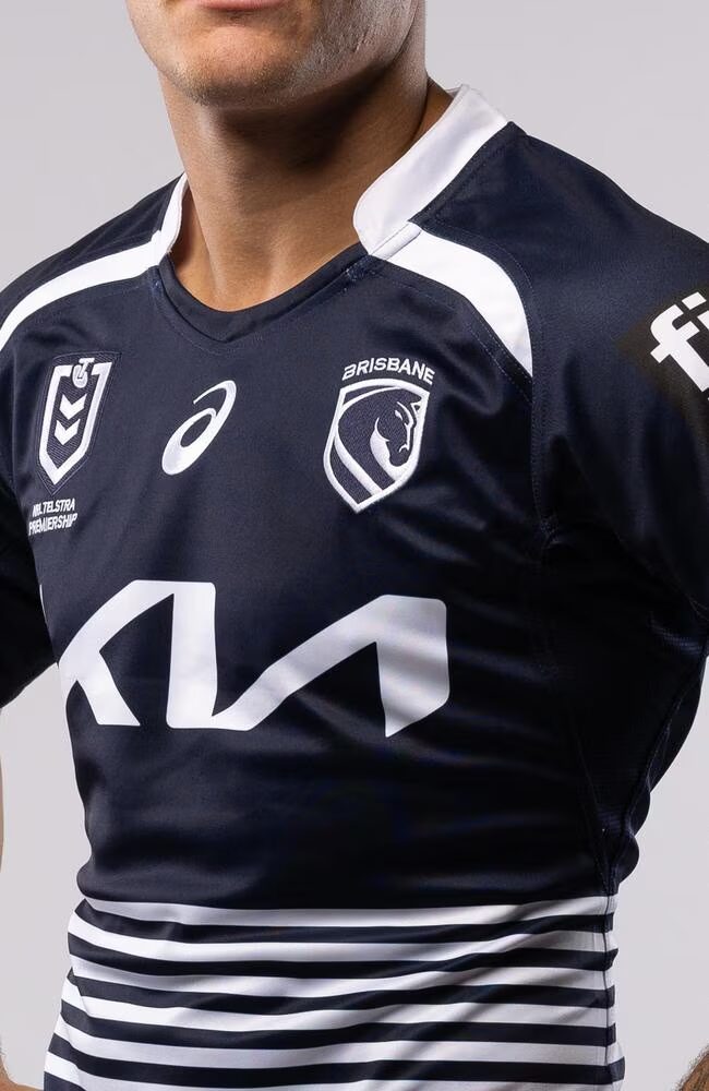
The New Broncos logo meaning becomes clearer when the emblem is placed on jerseys, signage and digital content. For example, during fast sideline camera pans, the front-facing horse remains readable — something the older curved profile struggled with.
How the Jerseys Fit
Brisbane’s 2026 kits were built to work with the new crest:
- Home jersey: features a cleaner maroon-gold balance, avoiding heavy outlines to keep the shield dominant
- Away jersey: the navy Cyril Connell tribute connects present-day branding with Queensland’s legendary grassroots figure
- Small heritage cues: subtle stitching and trims preserve recognisable elements from past eras
The Role of “We Charge On”
This mantra serves as the emotional framework of the rebrand. It appears:
- internally, in team culture messaging
- externally, across digital rollout material
- subtly, in jersey details such as collar prints
It’s designed to capture momentum after the 2025 dual-premiership season while signalling continuous progression.
How Fans and Analysts Interpret the 2026 Identity Package

Explainers like this are often needed because sports rebrands can split opinion, and the Broncos’ update is no exception.
Supportive interpretations:
- Fans who prefer modern aesthetics praised the simplicity and versatility
- Graphic designers highlighted how the shield works better in digital scoreboard layouts
- Some supporters likened the shift to rebrands by clubs such as Juventus or Melbourne City, who moved toward minimal, global-ready symbols
Critical interpretations:
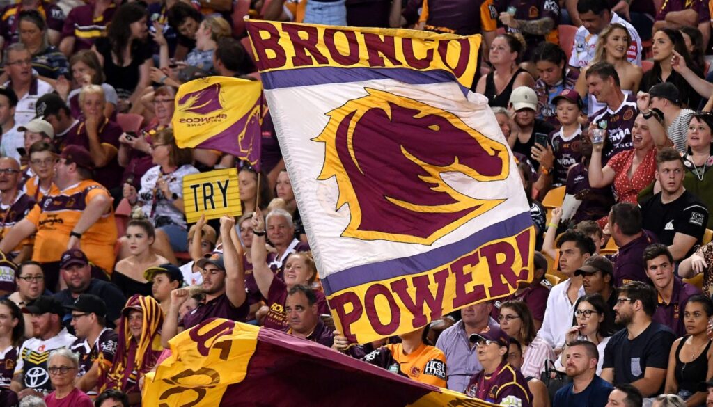
- Traditionalists miss the older side-profile horse and sharper facial lines
- Some feel the city-only wordmark weakens the club’s emotional identity
- Others felt the design looks more “corporate” than “club-driven”
This range of feedback is typical — similar reactions occurred when the Warriors, Bulldogs and Wests Tigers updated their logos over the past decade.
Conclusion: A Streamlined Identity Built for the Next Era of Brisbane Sport – New Broncos logo meaning

The Broncos’ 2026 identity overhaul is designed as a flexible system capable of performing across broadcast, merchandise, community campaigns and digital storytelling. The shield, jersey trims and “We Charge On” slogan form a consistent visual language that blends modernity with selective heritage touchpoints.
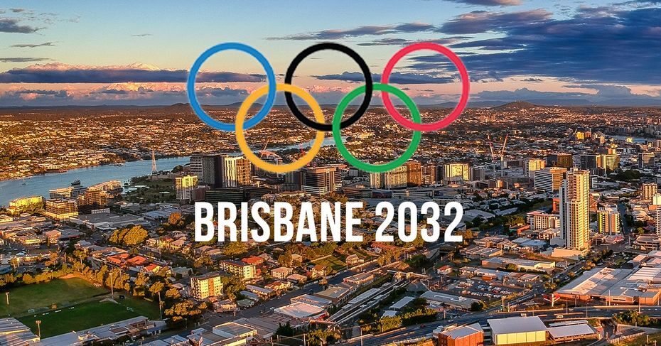
Whether warmly embraced or debated — which is normal for any major sporting identity shift — the New Broncos logo meaning reflects a strategic decision: aligning Brisbane with a global sports presentation standard as the city prepares for the 2032 Olympics and a rapidly expanding NRL footprint.

